Beyond the rebrand.
I connected user research, product decisions and front-end delivery — and became a point of contact for bringing AI-assisted workflows into UX and page development.
From research questions and data analysis to building a Claude-assisted Design System site and shipping new web experiences.

The problem was bigger than the brand.
Questrade was evolving its identity and financial product ecosystem. The website also needed clearer journeys, a more relevant experience and a technical foundation that could grow with the business. My work connected research and product conversations with front-end implementation.
From insight to implementation.
My contribution spanned research, data interpretation, UX collaboration and engineering. I also connected design and development teams around practical uses of AI to speed up iteration while keeping quality reviews in place.
The problem wasn't just how the website looked.
Questrade's earlier experience was perceived by users as dated. Feedback also raised concerns about finding information, understanding content and navigating a website built on an older technical foundation.
In a competitive financial-services market, the redesign needed to strengthen the digital experience while connecting an expressive new identity to real product journeys.
We also had to replace the website's older content and publishing setup with a more flexible platform, so teams could update pages more easily, reuse components and keep the experience consistent as the brand evolved.
How might we create a more intuitive and scalable experience without compromising the clarity and trust expected from a financial platform?
Connecting research, product thinking and engineering.
I worked as a Front-End Engineer with an active role in the UX process: shaping research questions, interpreting user feedback, turning insights into recommendations and participating in product and usability reviews.
With my background in both UX and engineering, I became a point of contact for the team's AI-assisted UX and page-building workflows. I helped explore how Claude could support faster prototyping and implementation alongside Figma, without replacing design judgment or quality checks.
I also built a new internal Design System website with Claude's assistance, moving component guidelines beyond static PDF documents into a more accessible reference for the team.
PORTO ROCHA created the brand identity; Tendril Studio developed the 3D and motion language. My focus was making that vision usable and practical on the web.
Understanding users before transforming the experience.
Working alongside the UX Research team, I contributed to defining research questions, reviewing feedback and examining where the legacy experience created friction for users.
Our research discussions considered visual perception, navigation, content comprehension and the expectations people brought from other financial experiences.
Ask the right questions
Helped shape questions about users' goals, difficulties finding information and their perception of the existing experience.
Look for recurring friction
Participated in research activities and examined feedback around navigation, product communication and usability.
Connect insights to decisions
Contributed to conversations about how findings could inform priorities across UX, content and implementation.
RESEARCH PRACTICES / RESEARCH PLANNING · USER FEEDBACK ANALYSIS · USABILITY RESEARCH
From feedback to actionable insights.
Research is more useful when the team can distinguish recurring friction from individual preferences. I contributed to analyzing research material and interpreting user feedback to identify patterns relevant to the digital experience.
My background in data analysis, including knowledge of Python, helped me bring an analytical perspective to these discussions — connecting qualitative observations with quantitative thinking and product decisions.
Design decisions should be informed by evidence, not assumptions.
Three opportunities for a better experience.
Research conversations and legacy-site analysis helped frame where the redesign needed to focus.
Navigation & discoverability
Make financial products and essential information easier to locate with clearer navigation and stronger content hierarchy.
Content & communication
Improve the clarity of product explanations, calls to action and interface language to support understanding.
Responsive & consistent UX
Support more cohesive experiences across devices and reduce inconsistencies in reusable interface patterns.
Keep the visual ambition. Make the next step obvious.
The legacy research brought navigation and content clarity into focus. Beyond the flagship pages, the wider financial product ecosystem needed to feel like one experience — without asking users to decode each product page from scratch.
Finding and understanding products
Feedback highlighted an outdated experience and difficulties locating information. Complex financial content also made clear labels and recognizable next steps especially important.
Clarity before decoration
We used consistent information hierarchy, more understandable product messaging and visible calls to action as guiding priorities when adapting the visual identity to additional pages.
Connect research to delivery
I brought research observations into UX and engineering discussions, considered content and navigation patterns with the team, and helped translate those priorities into reusable front-end approaches.

Connecting users, creative ambition and technical reality.
I helped translate the new visual direction into practical UX decisions, working with designers and engineers on what users would see, how interfaces would behave and what the team could deliver consistently.
Expression vs. clarity
Considered how expressive visuals and content hierarchy could work together without obscuring essential information and calls to action.
Motion vs. performance
Brought responsive behavior, loading considerations and accessible interaction patterns into discussions about motion-rich web experiences.
Consistency vs. flexibility
Considered how reusable components and shared interaction rules could support different financial products without losing a cohesive visual identity.
How the new visual direction translated into real page compositions, responsive layouts and interactive digital experiences.
DIGITAL APPLICATIONS / MOTION STUDY
Making design faster to deliver — and easier to scale.
The transformation also changed how we designed, built and published pages. We replaced an older website publishing system with a more flexible content platform and introduced reusable React and TypeScript components, helping the team create and update pages more efficiently.
Our creative partners established the brand's visual direction and motion language through selected flagship experiences, including the main website. But the broader Questrade ecosystem included many additional product and information pages that our internal team still needed to build.
To extend that direction consistently, we worked with Figma and Claude-assisted page drafts alongside reusable React and TypeScript components. I acted as a point of contact across AI, UX and front-end engineering, helping translate design references into practical page implementations while keeping responsiveness, content clarity and accessibility part of the review process.
I also built an internal website for the renewed Design System with Claude's assistance, replacing static PDF-only guidance with a more usable reference for interface patterns, typography, colors, component states and implementation decisions. The full website is internal; a selected view is shown below.
Updating content and maintaining consistent interfaces depended on older templates and documentation that was harder to reuse.
Designs and AI-assisted page drafts informed faster iteration, with reusable components, human UX reviews and a clearer source of guidance for the team.
Faster to create. Still accountable for quality.
As the internal team extended the new design language to additional pages using Figma, Claude-assisted drafts and reusable components, the UX question remained the same: could people find information, understand the product and recognize what to do next?
I participated in research and implementation reviews, connecting those questions with practical checks across desktop and mobile. AI supported faster iteration, but it did not replace human decisions about clarity, consistency or accessibility.
- 01 / USER TASK
Find the right information
Review how easily product information can be located and whether the page hierarchy supports common user goals.
- 02 / COMPREHENSION
Understand the next step
Examine whether messaging, navigation labels and calls to action make the available choices understandable.
- 03 / RESPONSIVE UX
Work across devices
Review layouts, component behavior and accessible interactions on smaller screens as well as desktop.
- 04 / ITERATION
Refine, then review again
Where a draft reveals friction, revisit its content hierarchy, interaction or responsive layout and review the adjustment before delivery.
The validation approach focused on making quality a repeatable part of page creation, rather than treating speed or visual polish as success on their own.
Before the launch. After the shift.
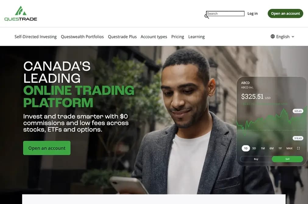
A historical homepage capture and a recording of the renewed experience show the change in visual language. These are different formats, rather than a screen-for-screen comparison.
A new identity. A more connected digital foundation.
The 2026 launch brought Questrade's renewed identity into a modern web experience. Beyond the visual change, we established more flexible page publishing, reusable UI foundations and an AI-assisted workflow for faster design-to-development iteration.
My work connected UX Research, data analysis and product discussions with implementation. I helped extend the flagship visual direction to additional pages through Figma, Claude-assisted workflows and reusable front-end components, and built a new internal Design System reference website with AI assistance.
Great design doesn't end in Figma. It has to work in the product.